
So, remember way back in May when MN’s top model[er]s were projecting possible scenarios for lockdowns ending? I thought it might be interesting to compare some of the predictions to reality after a good solid 5-approaching-6 months of data.
Note that I had to reverse-engineer the plots from the final report available on the state’s website, using WebplotDigitizer, which is handy for things like this. It was either that or recreate it from the code they released, which was more than I was willing to take on.
So, what I’ve plotted below are the following scenarios as presented in the last report linked above:
Y1 – Unmitigated
Y5 – “S[tay-at]H[ome]O[rder] till 5/18″
Y6 – SHO till 5/31
Y8 – CDC Opening + Tx (Translation: follow the CDC’s opening-up guidelines, assumes some decent treatments for hospitalized patients.)
Actual – I hope I don’t have to translate this one.
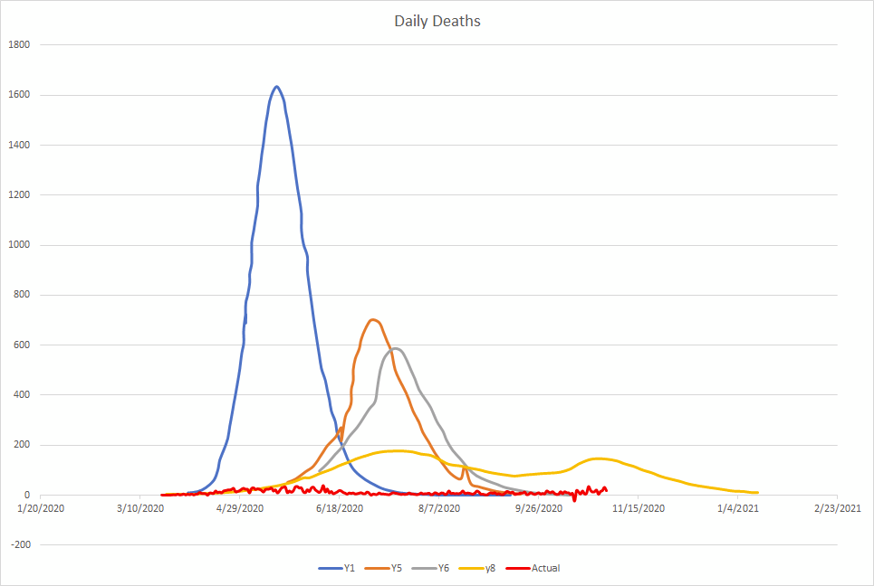
[Note, the bump in the Y5 seems to be an errant incorrect point I missed deleting in the digitizer.]
Seems like, maybe, we haven’t been doing as badly as people — who supposedly know their line of work — thought we would, right? The full-year mortality on their models ranged from 22,000 to 57,000 dead.
Although if you’ve been consuming only mainstream media this year, you are pretty sure we’re somewhere in the April 29ish range of Y1, aren’t you?
Recent Comments